
As we get further into December, it’s time for something colourful and festive!
From a young age, my parents and I disagreed on matters of taste. Their home, magnolia paint and olive-drab carpets – as one of the great philosophers of our time might have said, ‘why, oh why, oh why?’ (Rabbit, Winnie the Pooh and the Honey Tree, Gill, Disney et al, 1966).
One of the important style influences in our home growing up was that my folks got married in the early ’70s. G Plan, yup. Brown/yewllow/orange ‘Indian Summer’ plates, check. These were our every day things. But here was one coffee set that was never, EVER, allowed out. It was always fascinating and tantalising. From a young age, I was kind of fascinated by it, a mysterious thing lurking at the back of the cupboard. Or closet. Whatever.
Was it special, or precious? No, no mum just didn’t like it. She thought it was too of its period which, by the late ’80s and early ’90s, was not cool. It continued to languish in the cupboard in the dining room, with all the fancy glasses. They, at least, came out at Christmas, but the coffee set remained hidden forever.
Finally, when I was about 30, I asked my mum about it – and why it had never been out. She had no idea that I was so besotted with it. She made me a deal, which I think she thinks was a joke, and which I absolutely took at face value. If and when I got my new (wreck) house kitchen done, the coffee set was mine.
You’re on!
Now, all these years later, planning is in progress. My walls have been pretty much all white thoughout my time here (with one comedy exception). For the first time in probably 10 years, I’m actively thinking about colours…and the coffee set jumps to mind! Walls, details, kitchens…so much potential.

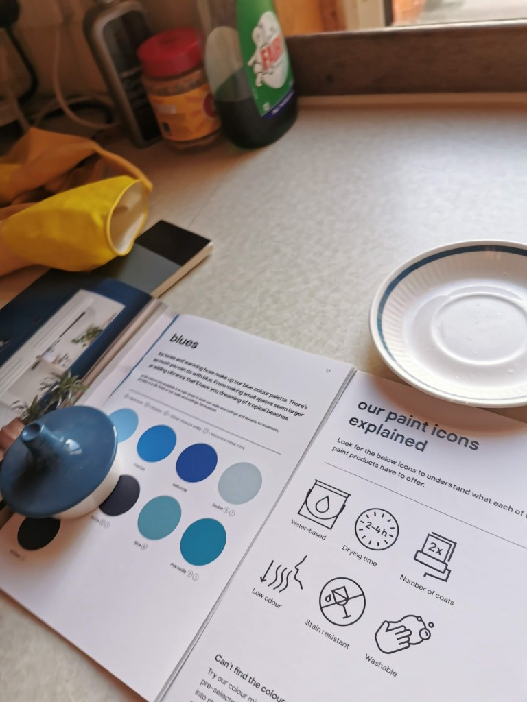
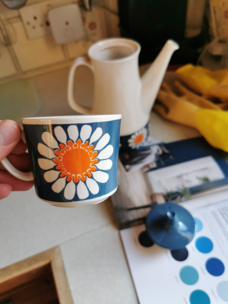
A few weeks ago, with my folks out of town, I popped by their house, mostly to tidy their mail – it gets caught under the door if they’re away too long. Can I help it if I had some colour matching booklets with me? #NotMyFault. In fact, B&Q had somewhat borked my plan by not having enough to hand, but it was still a worthwhile experiment. I also discovered what the set it – it’s Dasiy, by Turi Design of Norway – proper midcenutry Scandi chic!
Honestly, if I get my paws on it I’m not sure I could ever use them – too precious! But, displayed and admired…maybe. My current thinking is to try and do an accent wall of the living room (and maybe even going upstairs) in the blue, with orange accents around the room. I’m picturing it on the fireplace wall, so it’d be pretty dramatic!
What do you think? Check out the Insta and drop us a message with your thoughts!
